
Color Story
As the house has been taken apart, I have been looking for traces of the early colors that were used on the exterior and the interiors. And it turns out, boy are they ugly! There was really nothing that would inform the future color choices in the house, but it was interesting to see the information.
However, I will say that the more we took apart the exterior, the more the green-ness of this house deepened. I keep thinking of my color consultant friend saying, “Sometimes a green house just wants to be green!” The more time goes by, the more any color but green just starts to seem contrived. The green stain that was original to the house was VERY green. Rich, verdant green. Is a verdant green redundant? Yes—but it was seriously Lincoln Log green, as someone described it at some point over the past year. The green had seeped onto adjacent surfaces that were protected from being painted over, so we can see what it looked like on the raw wood. Green was also not limited to the shingles themselves, but even appears to extend to the window sills, which have deep layers of green under the later white paint. Let’s get to some archaeology, or at least stratigraphy (reading of the layers), here:

Here are an English curator (who works there—no cause for alarm), American architectural historian, and French curator (all had the longest arms in the group) muscling an honest-to-god Rembrandt painting off a wall at one of England’s great houses to show us the paint stratigraphy behind it — a thrilling behind-the-scenes moment.
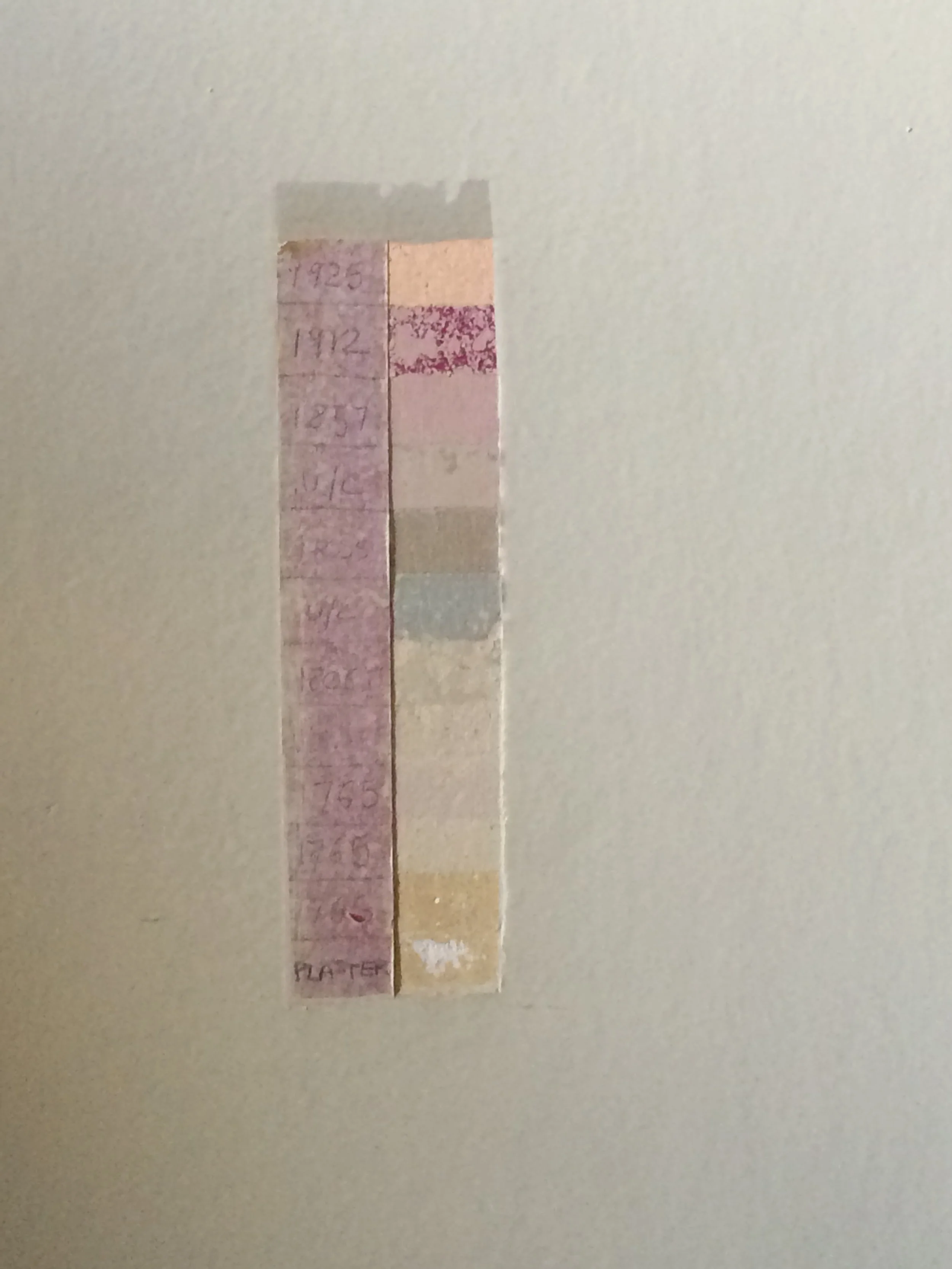
This is how it’s done! In this area of the wall, behind the painting shown above, conservation scientists removed layer after layer of paint and somehow dated them to various redecorating campaigns (I assume by correlating with records from the site). The house was built in the 1750s. Raw plaster is at the bottom, and the dates above that I can read clearly are 1765, 1857, 1912, and 1925. This little rank of samples encapsulates one thread in the history of a room in an extremely tidy way, even if it takes a conservator and a historian or curator to interpret it properly.
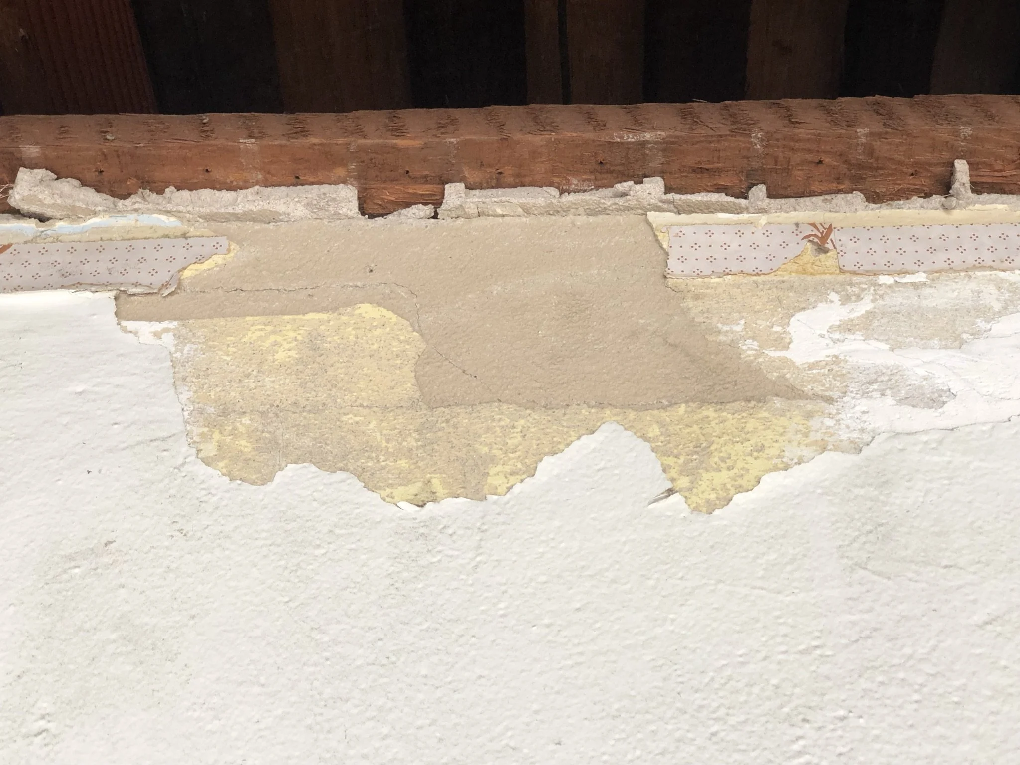
Our stratigraphy looks more like this. Here’s a view of the plaster at the top edge of the wall in the back bedroom. The tan is probably raw plaster and the yellow looks like an early layer. There’s some kind of wallpaper that was only left behind the skinny picture rail at the top of the wall, which is weird—was it stripped from the rest of the walls at some point? And how did it end up behind the picture rail, which presumably was installed before the walls were papered or painted? This raises more questions than it answers.
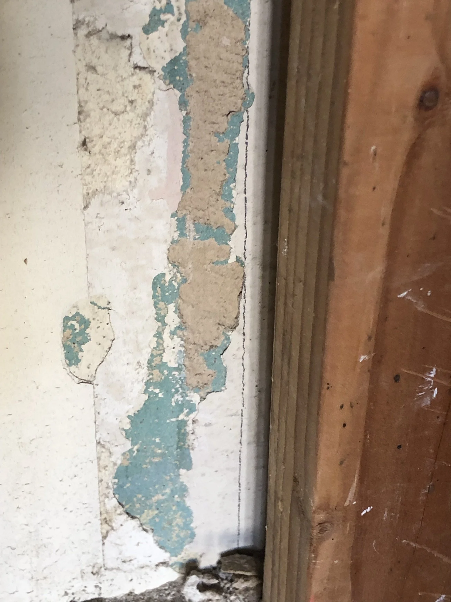
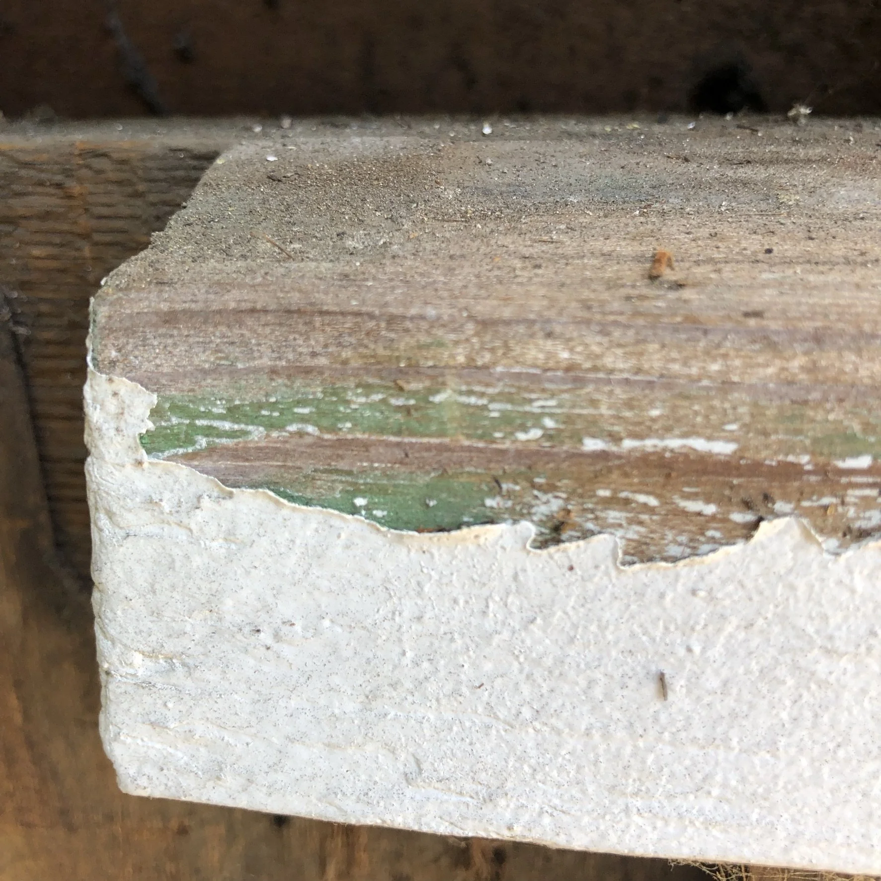
This patch was in the dining room. That tan color of the raw plaster shows up again. The oldest color layer might be that turquoise color. Turquoise!? The next layer appears to have been a pale yellow. And then pink on top of it for good measure. Yeesh.
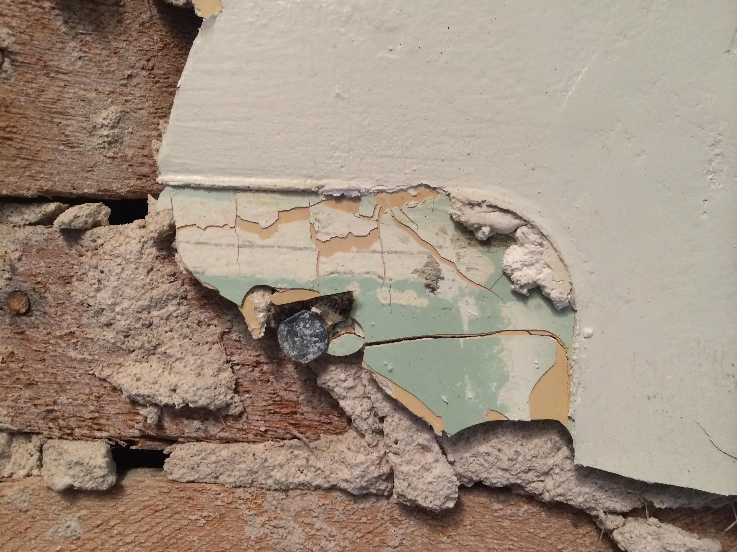
This was what we found in the original bathroom of the house when we had it remodeled in 2014 before we moved in. The light in this image is a little too warm, but there’s a minty green and a pink layer. That lowest layer looks a bit gold.
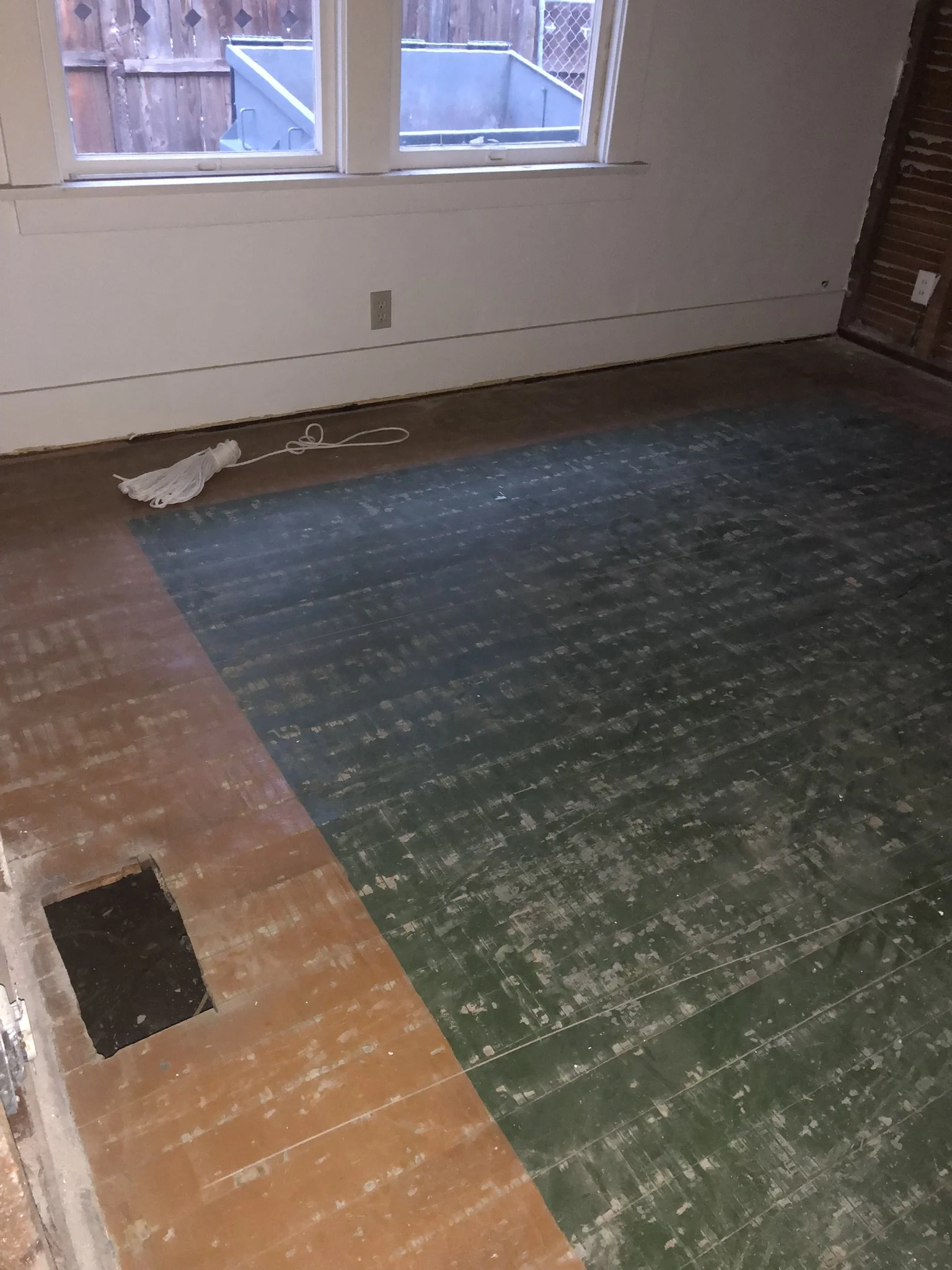
Here is some painted FLOOR color. I wasn’t expecting that. The bedrooms had narrow strip, plain-sawn (not quarter-sawn) oak flooring, which seemed disconnected from the fancier quarter-sawn oak of the living and dining rooms. This really isn’t how the hierarchy of flooring normally goes. They would never, c. 1910, have used two different grades of oak in one house; they would use a hardwood (almost always oak) in the main rooms and a lesser wood (almost always fir in a house of this grade, or sometimes maple) in the secondary rooms or second floor. Some houses would have had all oak or all fir, too. Just not two grades of oak. So when the plainsawn oak was taken up, I was not surprised that it turned out to have been laid at a later time. There was, in fact, earlier tongue and groove fir flooring underneath, which was also the finish floor in the bathroom and kitchen (both were still intact under much later vinyl flooring). It’s clear that they used the fir flooring as a finish floor for a while, and it was mostly likely painted due to wear (and later covered with plain sawn oak, if you’re following me…). In the middle bedroom, it had this decorative color scheme of red border and black field, and in the back bedroom it was a sort of gunmetal grey. I believe from the dimensions of the later plain-sawn oak floor that it was installed over the fir flooring in the 1920s.
Below, now, are several greens that show up on the exterior.
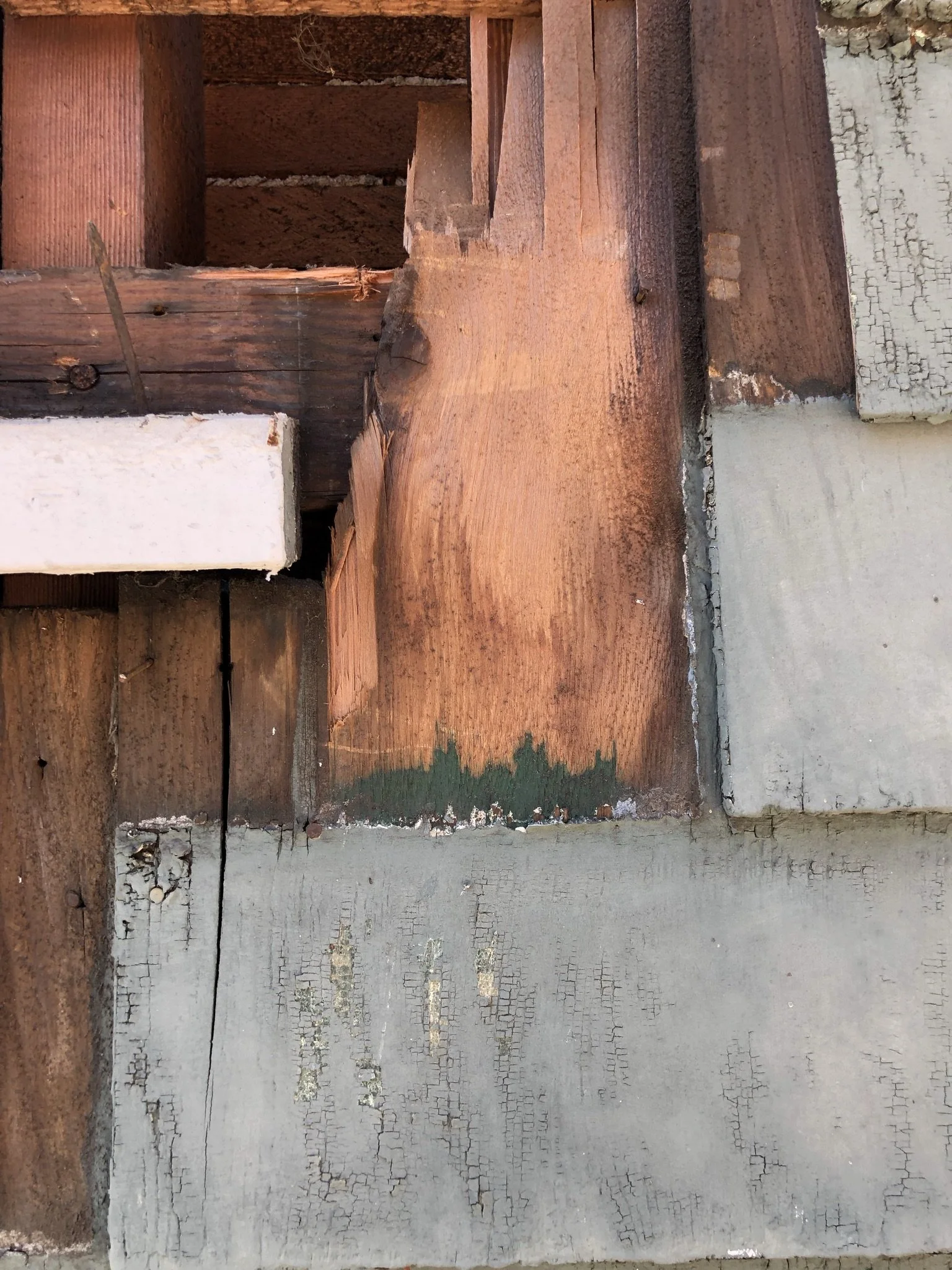

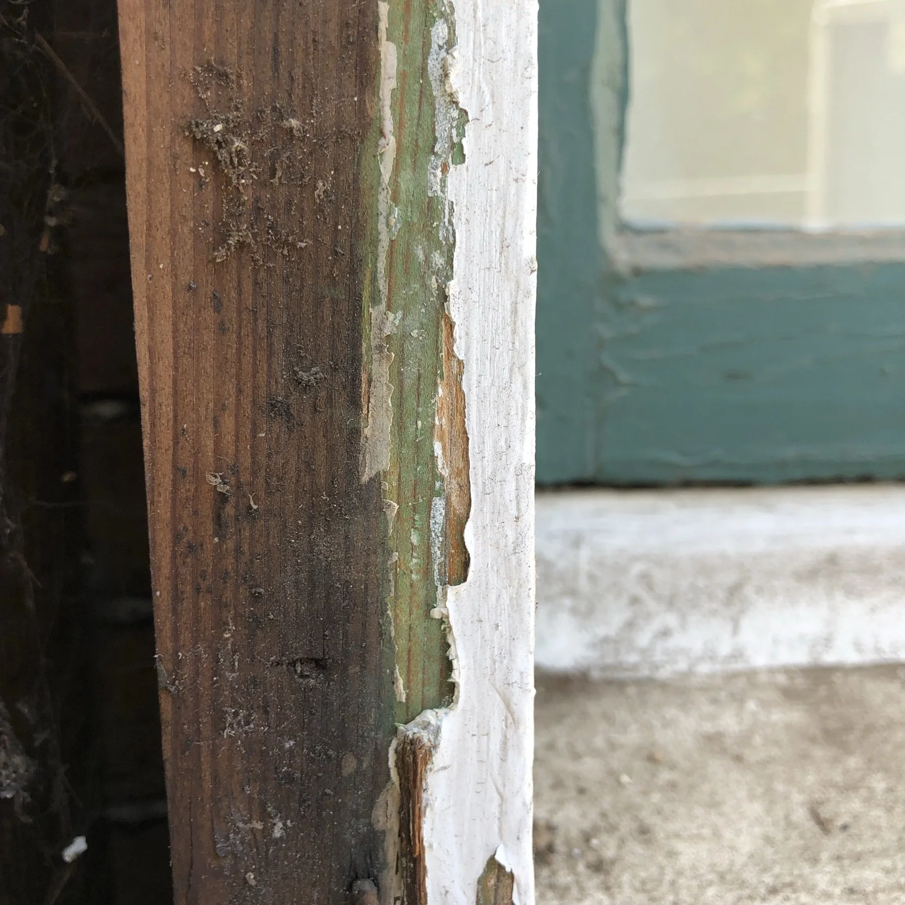
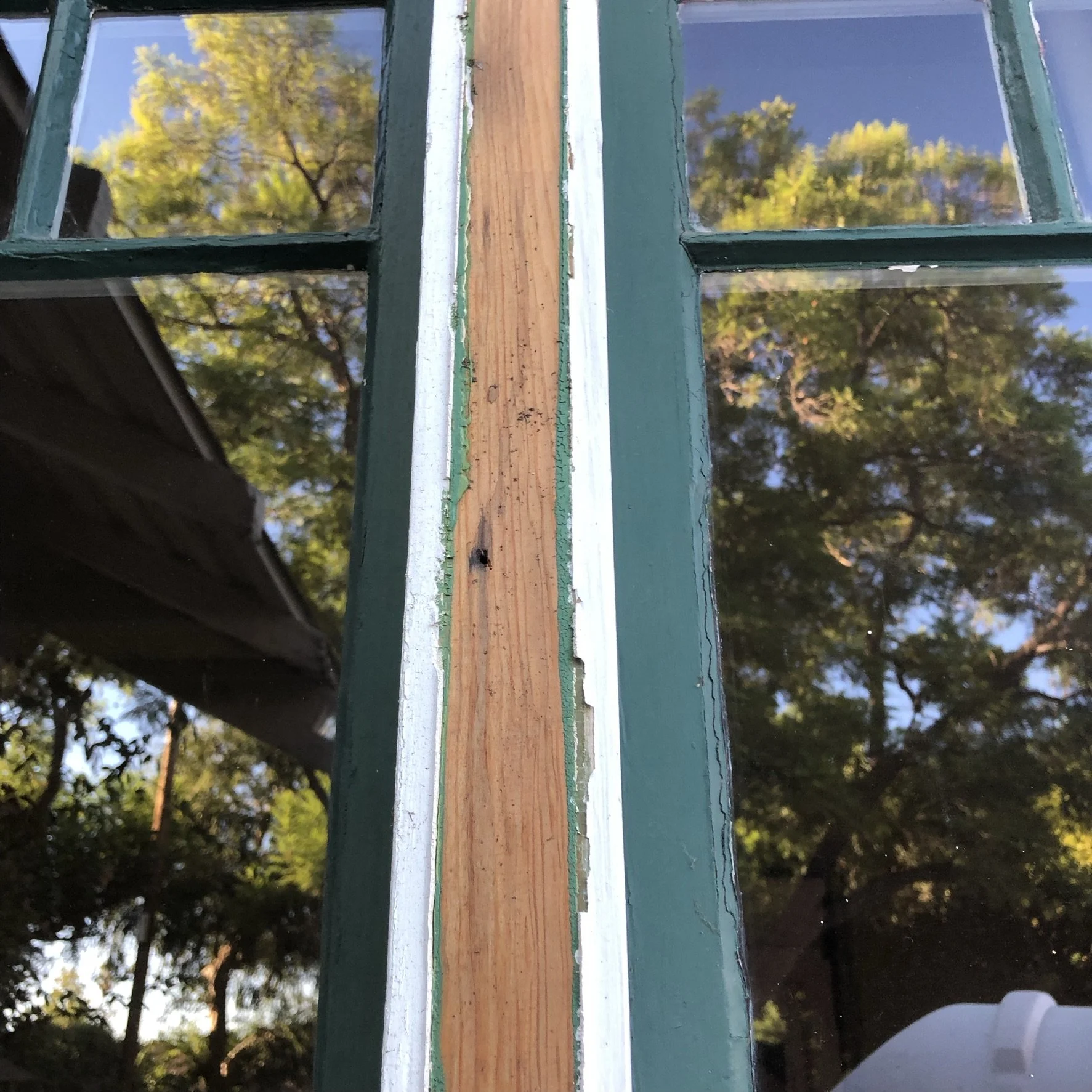

You can see from the above photos of the exterior that there was green paint lurking under everything—a dark green bleeding under covered parts of shingles, where it wasn’t affected by later layers of paint (top row), sills (bottom left), window casing (middle row and bottom right), etc. It’s a little hard to picture how all those greens came together, but they are clearly the first layer of color on most of the components of the house’s exterior.
Here, below, are the NEW colors for the house’s exterior from left to right: shingles, trim, and window sash. We took liberties with that last one (the very dark, highly contrasting window sash isn’t quite Craftsman), but I think it will be very sharp. If only the painters could find enough people to get on with the shooooooowwww! Darn COVID-driven labor shortages. Their next move will be to back-prime the shingles and stain them before they are placed on the house. Eager to hear them get nailing out there. The house has its plywood sheathing completed now, and they are almost done wrapping it in Tyvek house wrap. The shingles will be the next thing to go on. I can’t wait.

Left: green opaque stain for the shingles—this is the body color. Center: eaves, trim, and window/door casing color; Right: Sash and door color (in the background is the current too-white of the trim).

One of our neighbors has spent a lot of time looking at Craftsman style architecture and certainly did his homework in preparation for the expansion of their house about 20 years ago. He wondered aloud about the white trim on our house, which is one of the things we, too, long wanted to eliminate. But at some point along the way I realized that many English Arts & Crafts houses have light sash set in a very dark wall. Better yet, I also found this image dating to 1911, above, from a paint company brochure. This house is a bit like ours in the style, type, scale, level of fanciness, and even the window design, and the image was published only a year after our house was built. Judging from the colors we found at the lowest levels on our house, I think ours was similar in appearance to this, and it lends some support to my theory of the color scheme that we believe ours to have had historically. I consider our house to be only lightly Craftsman in style (like the house pictured here), even if it’s squarely within the bungalow type, so going with what we think of today as an ideal craftsman palette involving more dark greens, browns, even dark red or burnt orange accents, etc., started to feel a little contrived—even though it could have looked beautiful. I am happy we are sticking with green, and the new sandy-white that we have for the trim is so much softer and more delicious that what we have lived with in the past! We can’t wait to see the colors all come together.
**And here is an update, two years later: a colleague found a picture of our house that was published in Ladies Home Journal in 1915! More on that over here, but this is the relevant color information. First, the image:

Our house (yes, our actual house!) as it appeared in Ladies Home Journal in 1915 and again in the “Journal Bungalows” special publication in 1916.
Here were the comments about the color: “The exterior finish is a pleasing combination of shingles left to weather, and white trim with cobblestone for the foundation and for porch piers.” So in the VERY beginning, the shingles were not painted at all! The green layer may have been the first color they selected when that plan wasn’t working for them. And yes, the trim was indeed white from the start! But as you can see from the image, the barge boards (facing front along the ends of the gables) and the gable vent were not painted and appear to be the same color as the shingles. Another surprise was that the window color does look pretty dark, though we have no indication of what color it was. But the windows were not the same color as the white trim—there was a contrast as we have gone for.